
Painting metals is interesting. Quite often as a new painter, we see a paint that has the flakes in it, and we go "Oh, that's obviously for metals" and we use it, and we're very happy with how it turns out because the flakes mixed into the paint do their very best to reflect the light wherever you are, accurate to how real metal acts.
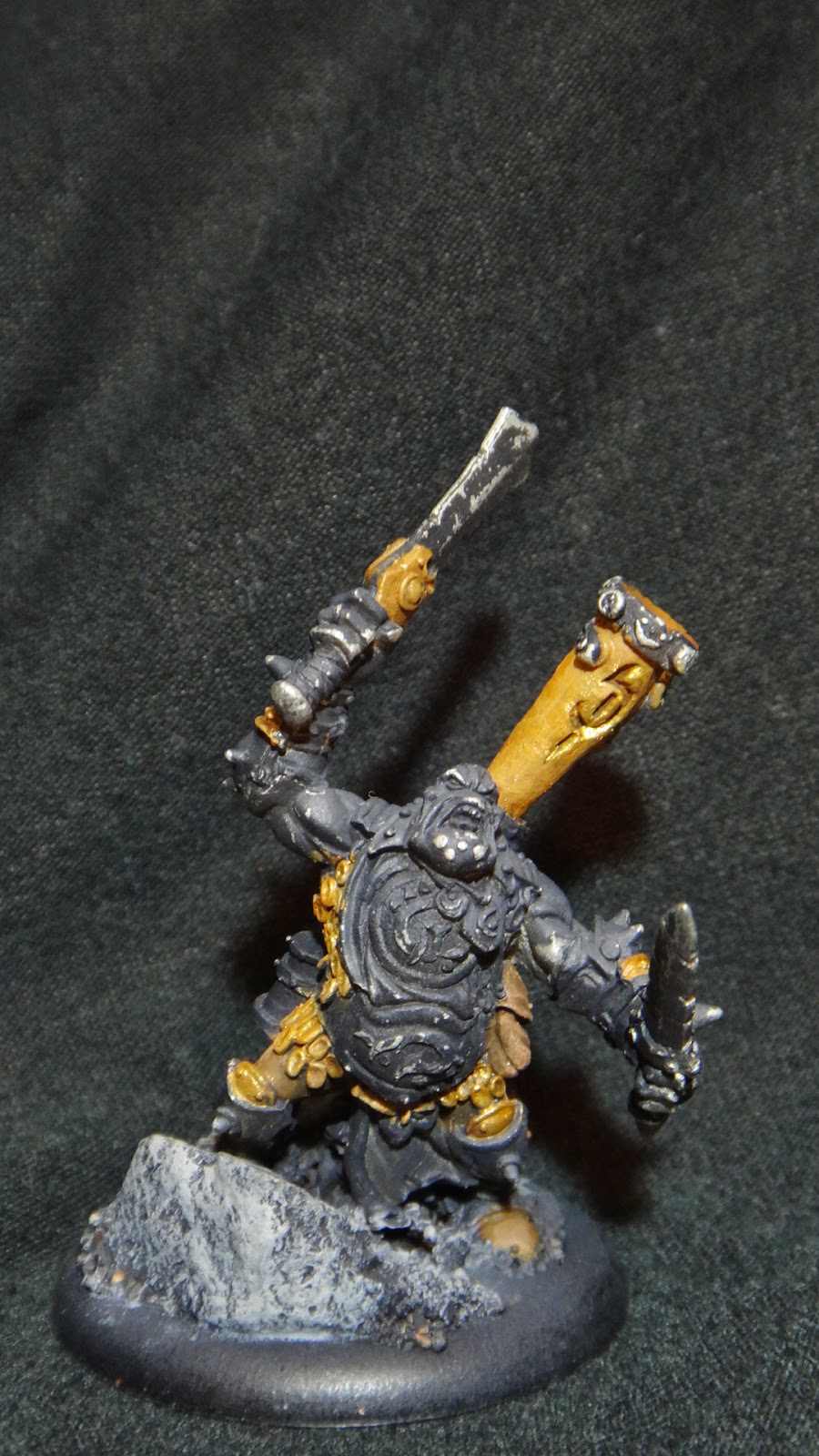
That works ok the first couple of times you do it, but after you start shading things, you notice that the metal is rather flat. So you buy 2 more shades of steel out of the 5 that so and so company offer, and you attempt some metal shading. See my axer's blade and armor below.

Couple different shades of metal, touch of highlights, a wash, highlights again. Some guys can do this really well, and it's where most of us hang out when painting metal. We catch what we know is going to be brighter, and hope that the paint does the rest for us. The other side of the coin is:
NMM, or Non-Metal Metalics. The reflection and lighting is still there, but it's painted based off of the artist's preference, and generally looks very clean. There's two sub-categories to NMM. The first is realistic looking NMM, or a paintstyle that is looking for the same realistic (ish) quality the rest of your model is looking for.

This is from Arthur Nicholson's blog, which is still being updated. Last update was the 16th, so if you're looking for a painter to watch, here's a guy. His NMM is beautiful, and just destroys our perception of regular metalics.
The second version of NMM is a non-realistic version that Arizona_Troll on the Privateer forums is known for.

I showed this the other day, and I think it's a perfect example. The goal here is to represent the model in a more cartoonish style, as it's been described. Wholesome colors, very well done gradients, subtle colors. His thread is here if you missed it before.
What we're going to talk about today is trying to blend the two styles. I'm no expert by any stretch of the imagination, but I've had much better luck being able to blend metals when I have more control of the colors. Especially with armor where I want a higher contrast, I can mix black into my base metal color, and have it primarily black with just a little bit of a sheen from the metalics in the paint. I never particularly increase the sheen, but I lighten the color with each shade, until the very final highlight that is usually the brightest chrome/gold that I have.
The paints and support I am using are Vallejo and a retarder from Golden Additives (I think I got it a hobby lobby). The paints are:
Game Color Beasty Brown (My base color)
Game Color Glorious Gold (My base dark metal)
Model Color Desert Yellow (My highlight)
Game Color Polished Gold (My highlight metal)
Model Color Marron Chocolate (My wash color)
Thinner Medium
If you haven't worked with Vallejo before, it's a miniature paint that comes in dropper bottles. I find that I have to water down Vallejo the least, especially compared to GW's stuff. I also like their range considerably, but it doesn't matter because since it comes in dropper bottles, I'm always going to be mixing it. You'll notice I mentioned Game Color and Model Color. The GC will have a wider range, your blues, reds, all that stuff. It's designed for the wargaming world, be that 40k, Fantasy, WMH, Infinity, you name it. MC is for your Historical model hobbyists. The panoramic display stuff that focuses primarily on WWII tanks, planes, etc. So if you're looking for very specific greens, tans, browns, greys, those are in the Model Color range. I haven't noticed any difference in consistency from one to the other, but rather, where they are sold. I can find the Model Color range at Hobby Lobby, or next to the Flames of War displays at the game shop, and I can find the Game Color range at most hobby stores. So, let's paint.
My base mix is a 1-1 Beasty Brown and Glorious Gold. I add in a little retarder so it dries just a little slower. There's two reasons for this. It adds a medium to the paint that's cheaper than just adding more paint, and secondly, it keeps from drying so quick. This is cool for blending, but more importantly, it's cool to keep the paint in the pot wet while I'm changing podcasts, and taking pictures. My Fell Caller is basecoated in black, which normally would be an issue for metal paints, but since we're mixed with a regular paint, that's not going to be as much of an issue. I think it still took two coats, but I'm ok with that.
You'll notice that the shade's are fairly similar to the leather brown stuff already on this model. The wood barrel, the legs, that stuff is not being painted currently. You're looking at the horn on the back, the armor scales, gauntlet and a little bit of the leg armor.


So the base coat is down, and despite the shadow on the horn in the left picture, it's not reflecting a whole lot. A little, but not much. I add some Desert Yellow and an equal amount of more Glorious Gold. The entire amount of paint added is about a third of what is in there now. I also add three or four drops of thinner. You can use water for this. I bought my thinner for my airbrush, and I like it for this application as well. Brush everything that's not in a recess, except on the main horn. I try to stay out of the cracks, and I'm not painting underneath the horn.


I'm not liking these pics, so I change the background.


Now I mix a wash. That Marron Brown with water at a ratio of 1-4. I used a number 2 liner brush (bristles about an inch long) and put a little bit of wash on it. I washed all of the bronze, and took it off in excessive areas.

Now I add just a little desert yellow to the mix, and some of my lighter metal, the Polished Gold. The ratio is probably 1-2, maybe 1-3. There's already some desert tan in this paint, and the Polished Gold is going to lighten the mix already, so there's no need to bomb it with the Desert Yellow.
Don't be afraid to keep some paint on your brush instead of brushing off the excess. You really struggle to build up any difference in shade, whereas if you leave paint on the brush, drop it on there where your first impulse is "Oh man, I just ruined this thing", but then spread it out with your brush, it will blend better, and you'll get a better contrast. On this pic, you see the color transition best on the sword hilt.

Keep adding Polished Gold as you continue layering/blending here. You'll start seeing the light reflecting off your painted areas decently, but not nearly as mottled as it is normally, and you've got better control of the color.

For the final step, just drop a little bit of the Polished Gold by itself on your tray somewhere, and do the final highlights.

On the picture to the right, I can see where I failed to blend the upper side of the horn, so what I can do is bring some of my previous shade (the darker blend) and blend back up into the horn.

Unfortunately in this picture, I can't show the reflectivity that I'm getting with this mix of paint. Right here, it just looks like a brown. Holding it in my hand, it looks like a well-blended bronze, which is what I want. You can see it on the armor a bit more, but it's still not what I'm seeing.

Overall, I like this style of painting, and I've been very happy with it's results. In this case, I would have preferred more contrast, and I think I would have started with a darker metal, and the same brown. Vallejo GC has a dark bronze called Tinny Tin, and then a reddish bronze called Hammered Copper, and the Hammered Copper would have been a good contrast to this I think. Overall though, I'm very pleased with it. Give it a shot on a solo, see what you think, and let me know. Part II will be silver/grey, and should be here in the next couple of weeks.
Oh my word, just mention reflecting light and painted metal and I start to envision all sorts of possibilities. I think there are so many ways to work with the paints that you have described. However, I don't think that people get as many opportunities to work with metals as they should, probably because they are a little more expensive.
ReplyDeleteBernice Parsons @ Badger Anodising